Details & atmosphere
How to Choose a Wedding Colour Palette Without Making Everything Match
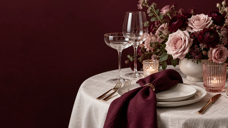
A colour palette is a way to connect decisions, not a rule that every object must be the same shade. Start with the atmosphere you want and a small number of real materials. The result can feel coherent without turning the entire celebration into a matching set.
Choose a starting point with some meaning
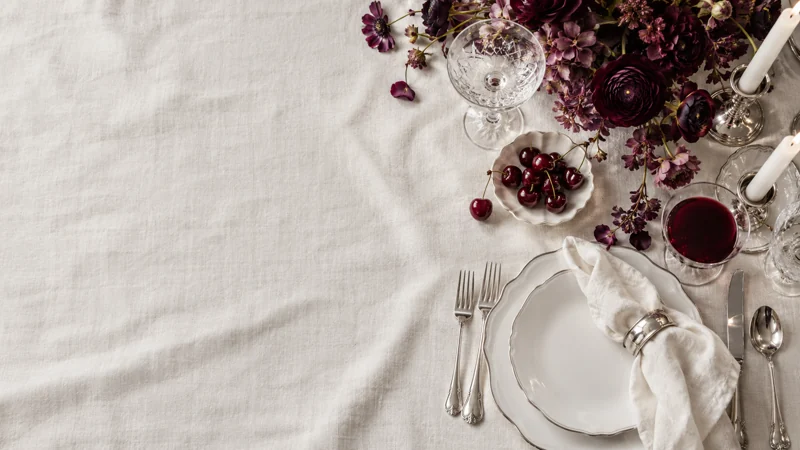
A flower, a fabric, an item of clothing or a favourite piece of artwork can provide the first colour. Choose something you genuinely like rather than collecting every combination that looks attractive online. One clear starting point makes it easier to decide what belongs alongside it.
Describe the atmosphere in ordinary language as well. Quiet and intimate suggests a different balance from lively and theatrical, even if both use the same base colour. Those words help explain the idea to other people without relying on an exact shade name.
Separate the background from the accents
Large surfaces such as linen and the surrounding room establish the background. Smaller details can then provide contrast: flowers, a napkin edge, a ribbon or a line on the stationery. Decide which elements should feel calm and which should draw attention.
There is no need to assign a colour to every category. Leaving some materials in their natural or existing finish can give the chosen shades room to register. If the table already has strongly coloured glassware or furniture, include that in the composition rather than pretending it is invisible.
Test physical samples together
A screen is useful for gathering ideas but unreliable as the final meeting point for different materials. Put a fabric swatch beside a printed sample and the intended tableware. View the group in more than one light and from the distance guests will normally see it.
Notice texture as well as hue. A matte paper, shiny ribbon and soft flower can read differently even when their colour names sound similar. The aim is a pleasing relationship, not proof that each supplier's interpretation is identical.
Give flowers room to vary
A floral brief works better when it describes the intended feeling and colour range, then identifies any essential elements. Ask the florist which parts of the proposal depend on availability and which alternatives would preserve the overall look. Keep the final agreement clear rather than assuming one saved image is a complete specification.
A little variation can make the arrangement feel more natural. If every decision is tied to one exact swatch, a small difference becomes a problem. Agree which contrasts are welcome and which would change the character of the palette.
Edit the mood board before it becomes a shopping list
Remove images that introduce a competing direction. Keep a small selection showing the background, the accent colours and the textures. Add a note describing what matters about each reference; otherwise someone may reproduce the wrong detail.
Before approving another object, ask what it contributes. Does it repeat an existing colour usefully, provide needed contrast or simply add another thing to coordinate? A palette has done its job when it makes decisions easier and lets the occasion feel like itself.
Explore the subject: Weddings.